

Data
Visualization
Design Research
2022
This project was inspired by the "Dear Data" Project by Giorgia Lupi and Stefanie Posavec. They collected various types of data from their everyday lives such as how many times they complained and why, every time they checked the clock, and a week of their cuss words. Their project highlighted the "why" of data visualizing in order to connect to the humanity of ourselves and others through data. Check out the inspiration for this project here.
My take on this project uses a more digital approach and explores the things that take up some of biggest parts of my life: my dog, taking care of myself, and entertainment.
Research
Deliverables
This data visualization poster catalogs observations I made throughout a week of taking my dog Rambo outside to use the bathroom. It focuses on the activities and behaviors exhibited before and during a walk or outside break. I tied in Art Nouveau inspiration with originally crafted symbols and bold typography to give the visualization a warm retro feeling.
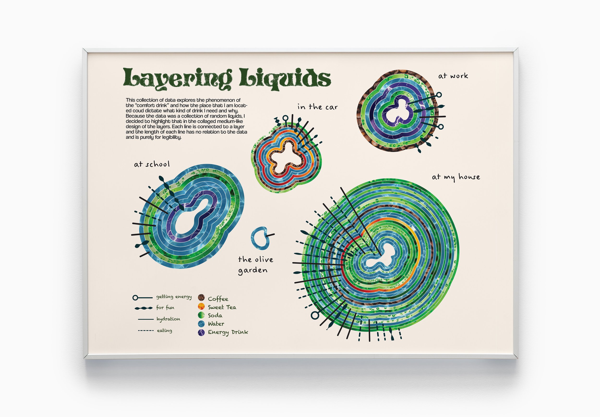
This collection of data explores the phenomenon of “the comfort drink” and how my location or activity could dictate the type of drink I “needed” in that moment. Because the data visualizes various liquids, I chose to highlight organic shapes with rings of different liquids. Each line in connected to a layer and the shape correlates to different reasons for drinking.
The CBS reality competition Big Brother is one of my favorite shows that features houseguest from all walks of life to simulate a “society” inside of a locked house. There are multiple episodes every week, keeping me very entertained and on my toes about who will win. Explore my obsession with this show, how each episode made me feel, where I was, and more through this data visualization.